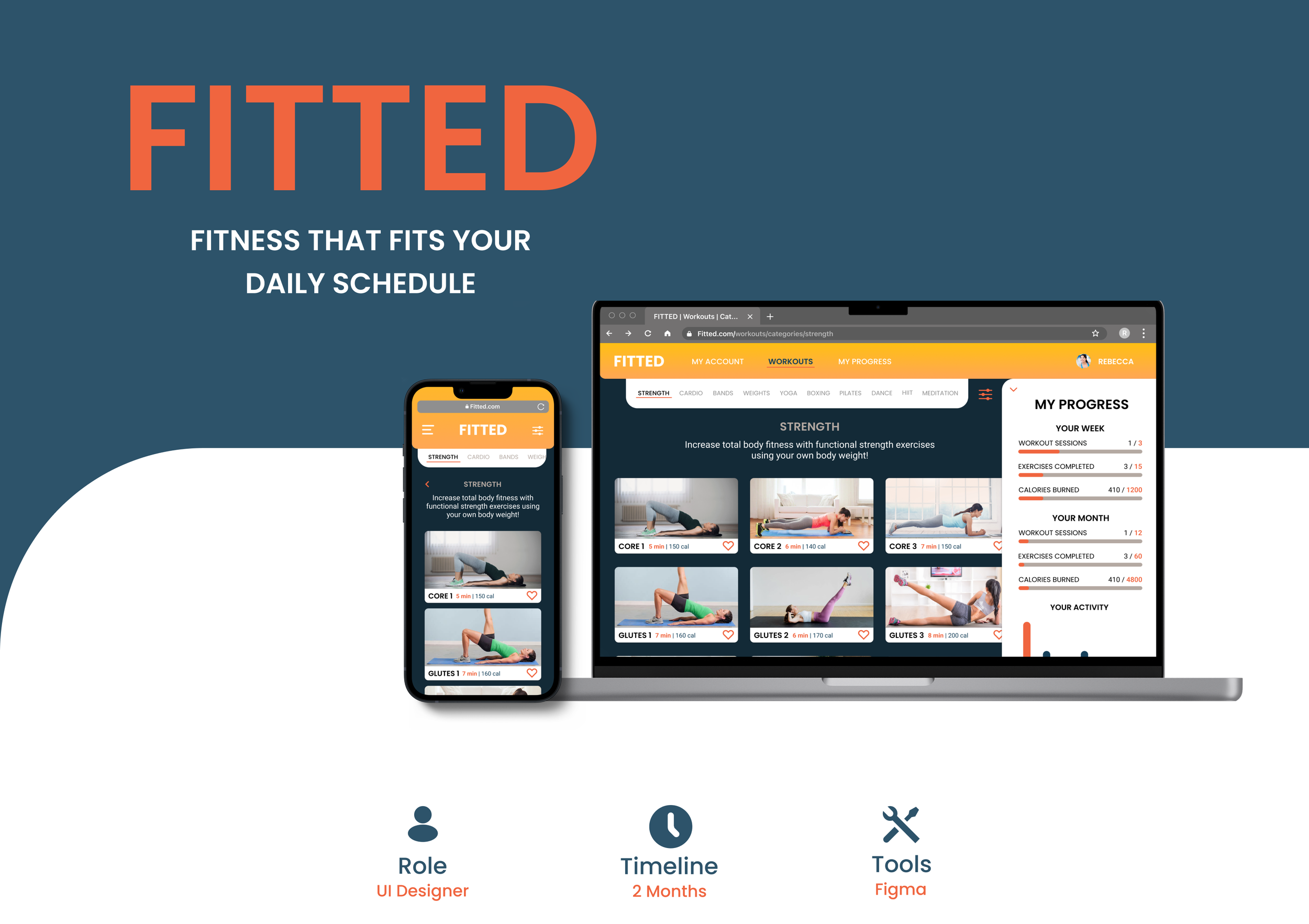
PROJECT OVERVIEW
THE CHALLENGE
Finding exercise routines for your level can be difficult, especially if you want to try something new. This web app aims to help people get into a workout routine of their choice, by providing routines, guides, interactive examples, and information.
THE GOAL
To develop a user interface for a fun, personalized, and responsive web app that motivates people into exercise routines which suit their individual level, schedule, and interests.
THE PROCESS
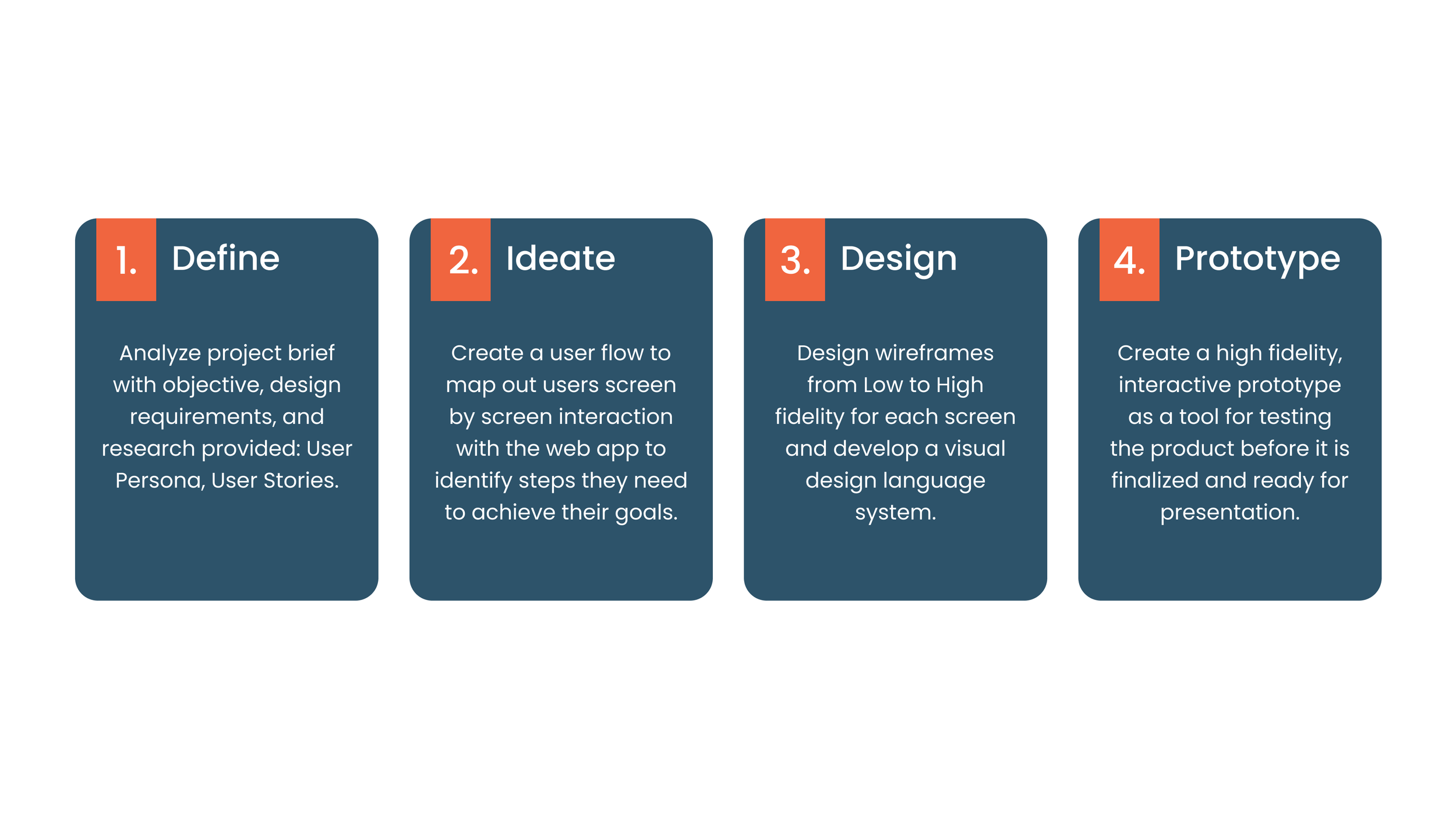
1. DEFINE
Due to this being a UI project, research on the target audience had already been conducted and the User Persona and User Stories were provided with the project brief. This helped identify who they are, as well as their goals and collective needs.
USER PERSONA
2. IDEATE
Focusing on three of the User Stories provided, a User Flow Diagram was created in order to give a clearer idea of what screens to include in the web app when our users interact with it in order to achieve their goals.
USER FLOW
3. DESIGN
WIREFRAMES
Using the Flow Diagram and the Persona provided, Low - Mid Fidelity wireframes were created in order to begin the Prototyping process. The screens below will focus on one of the apps core features: Browsing & Scheduling Exercises
LOW FIDELITY
Low Fidelity wireframes were drawn out with basic shapes and lines on Figma in order to get a general sense of the layout of each screen and illustrate how they functioned within the context of the users flow.
MID FIDELITY
Before adding color and imagery, Mid Fidelity wireframes were created in grayscale so as to map out the further developed features, basic UI elements and all text within each screen.
MOOD BOARD
Two mood boards were created based on keywords provided by the project brief: Motivation, Easy, Fun, Informative, For Anyone, Friends. The goal was to end up with two distinctly different color palettes and moods to choose from.
MOOD BOARD 1 (selected)
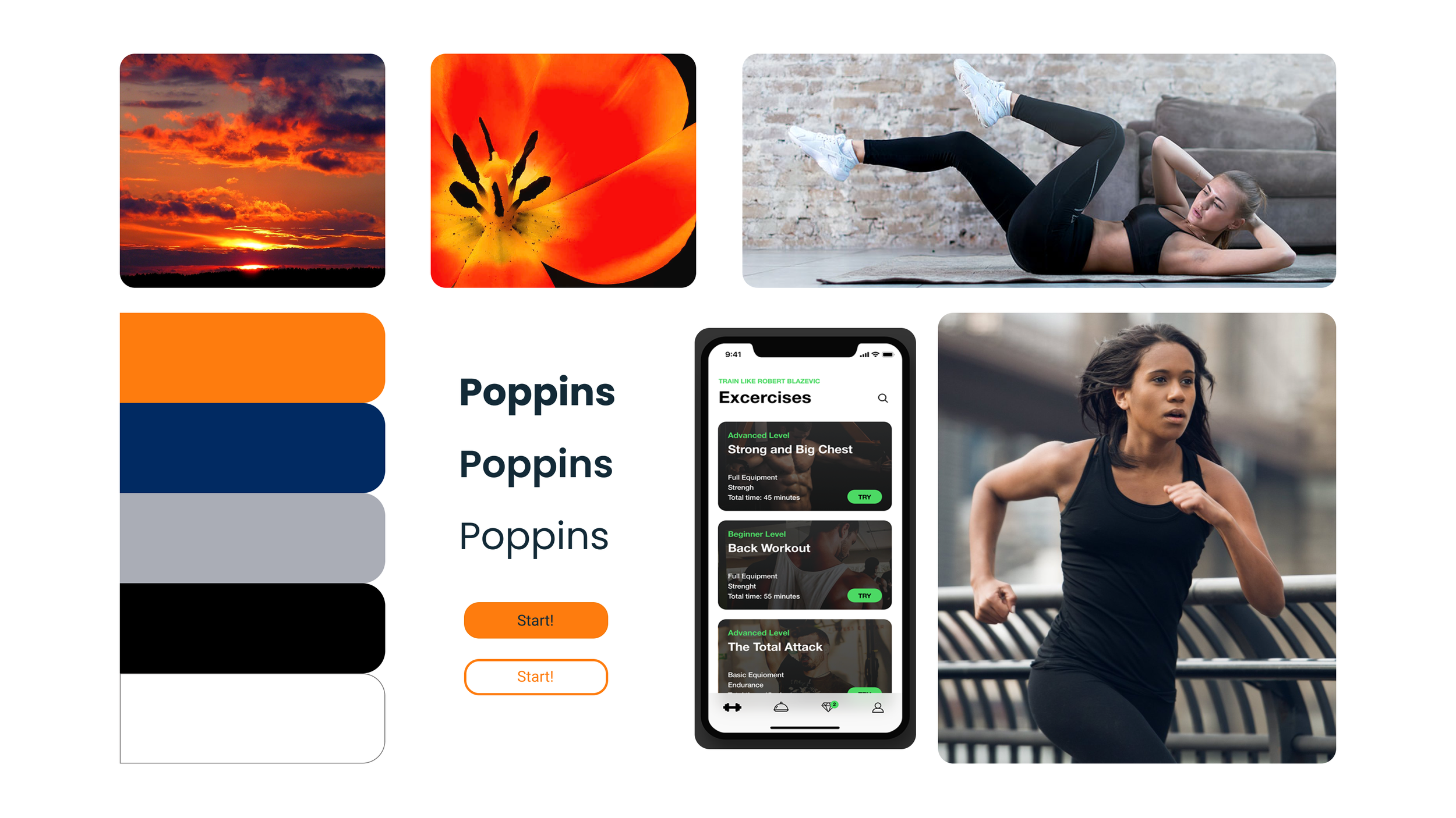
MOOD BOARD 2
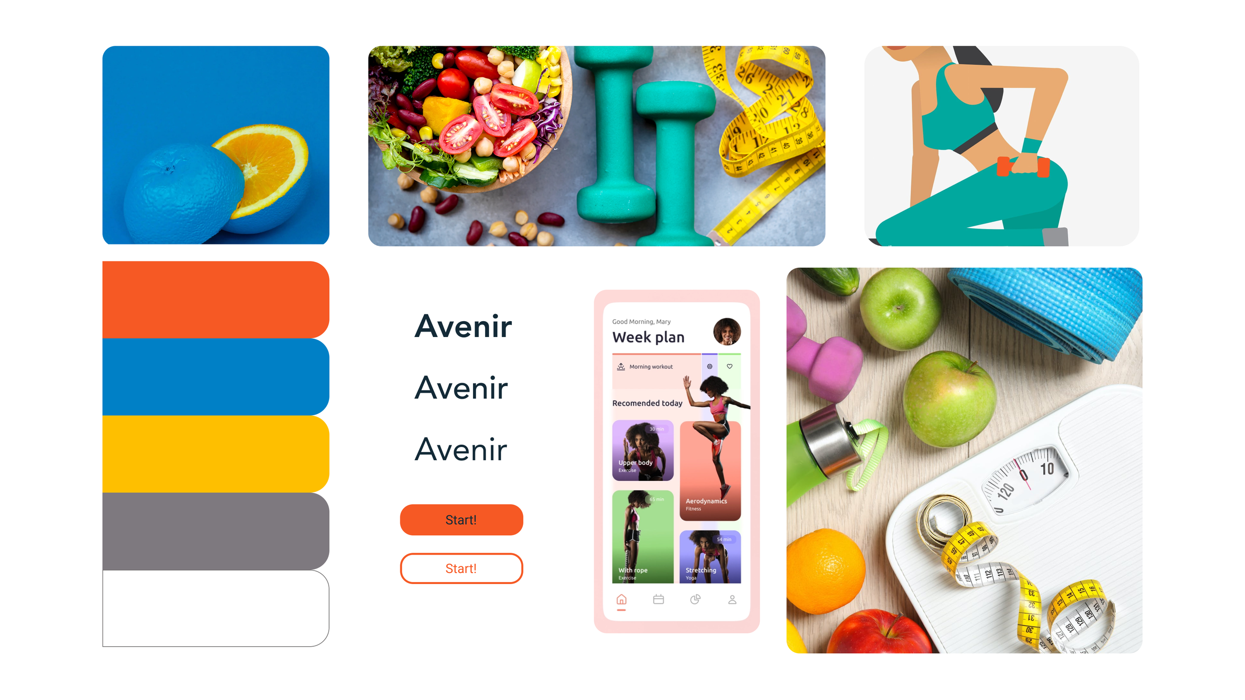
MOOD BOARD SELECTION & RATIONALE
For this project, Moodboard 1 will be selected because:
It is minimal and chic in design
Direct to the point but still motivational
Darker colors and tones address any contrast and visual related accessibility issues
Bright button colors provide great contrast against background
Images featuring real people would tie in nicely with video demos of exercises vs illustrations
More neutral in design so could work for larger audience
STYLE GUIDE
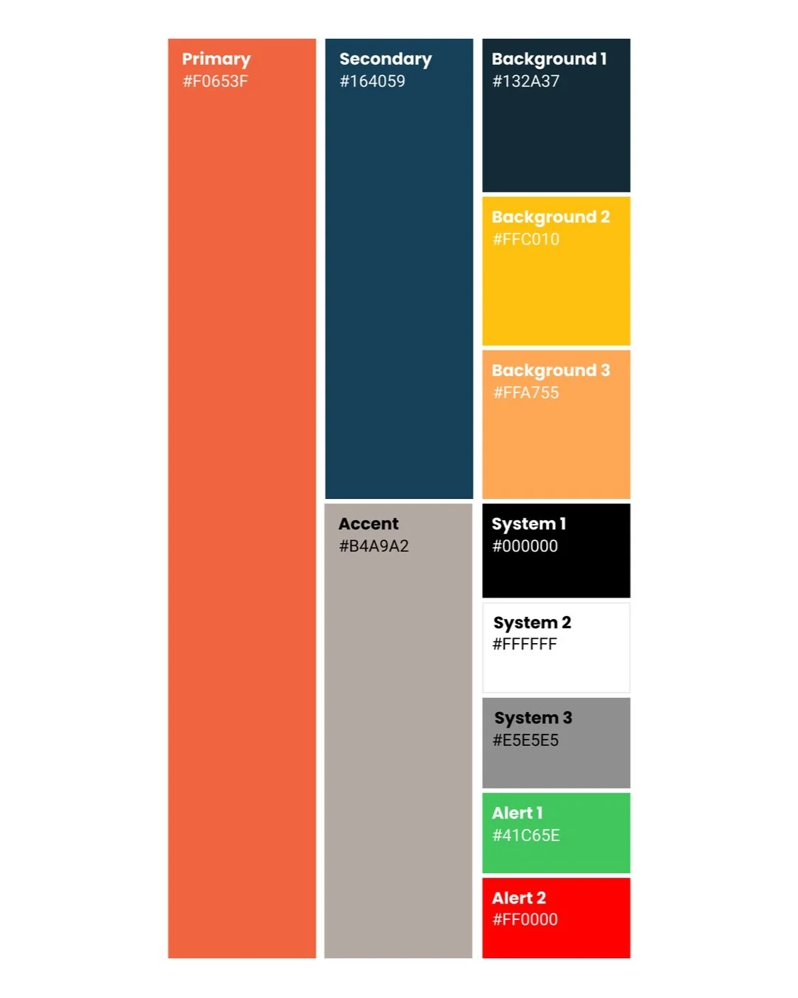
COLORS
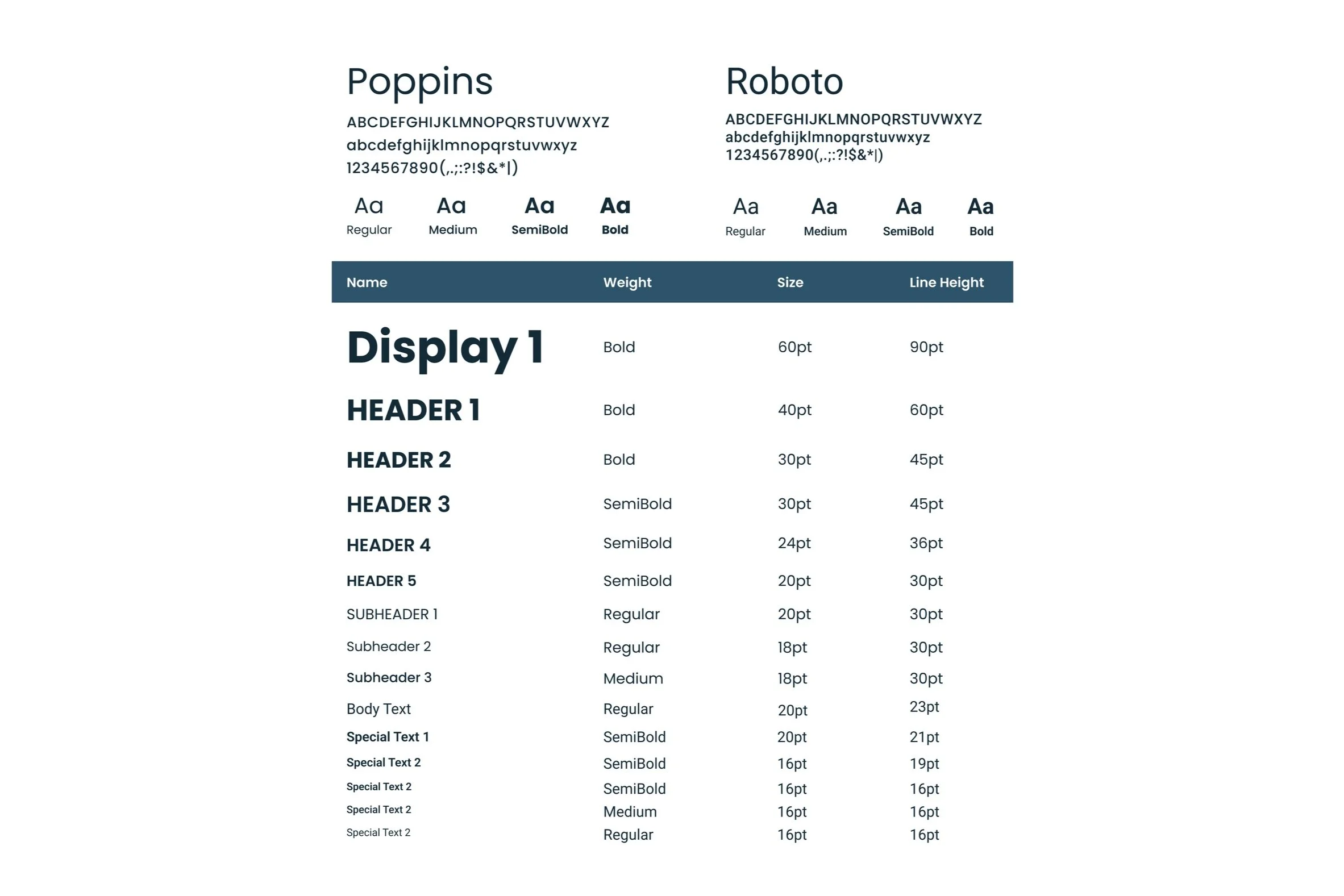
TYPOGRAPHY
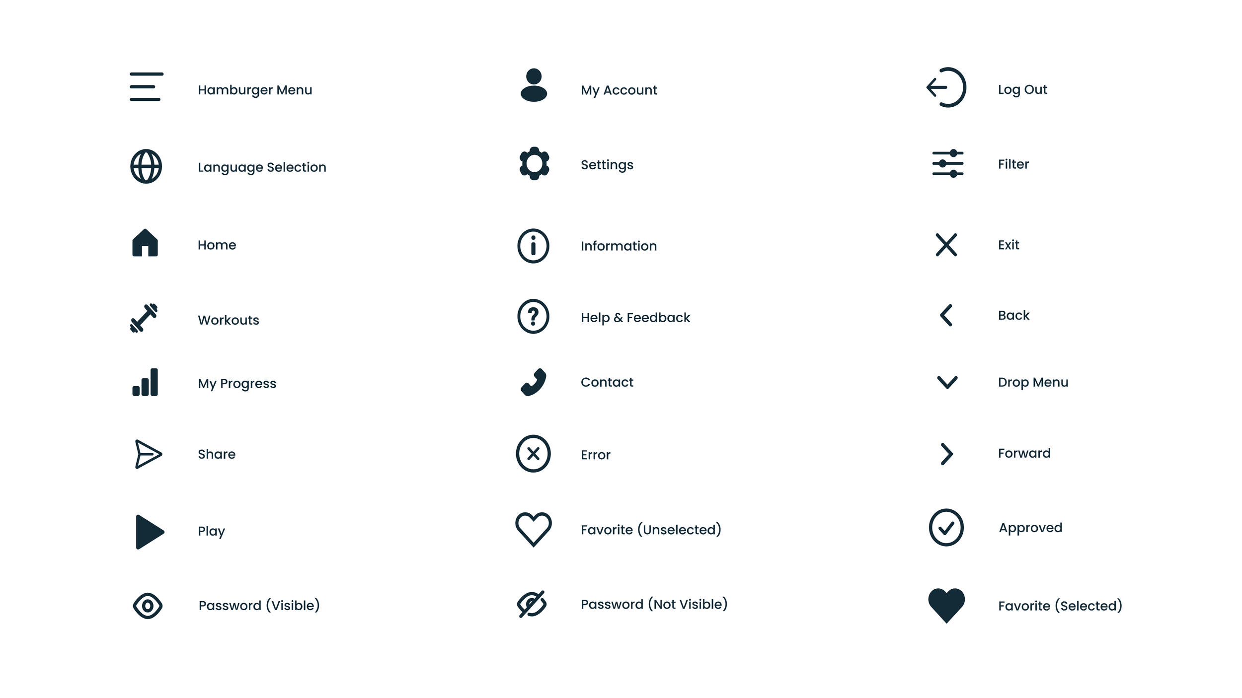
ICONOGRAPHY
UI ELEMENTS
IMAGERY
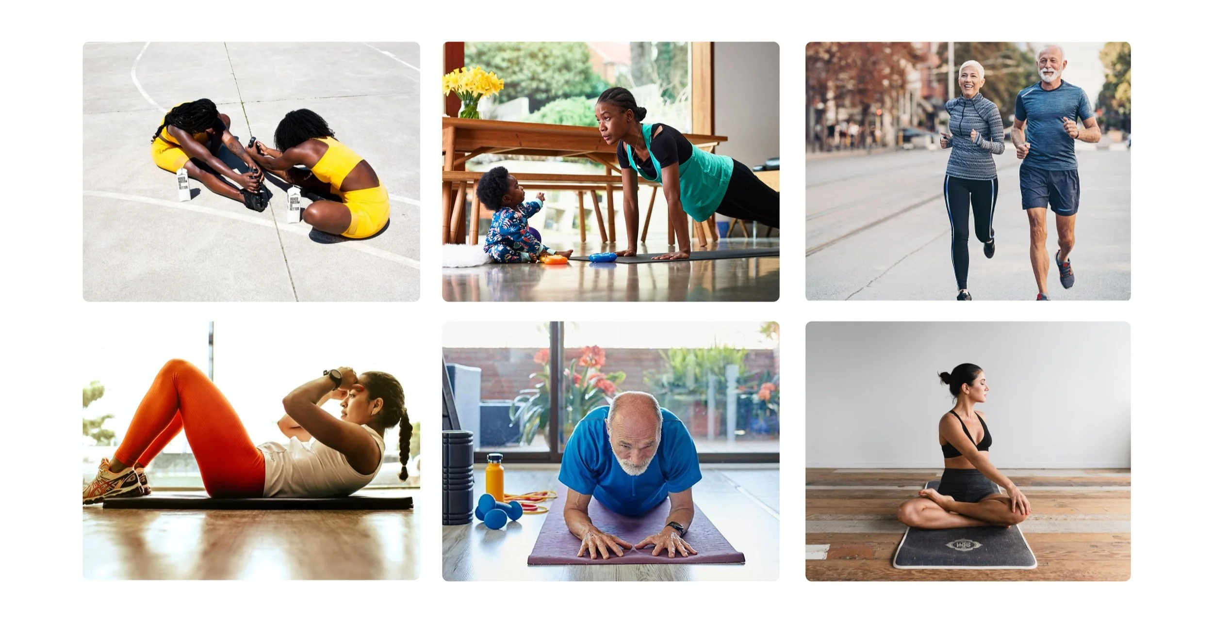
The imagery used for Fitted needs to be clear, bright. It should feature relatable individuals of all body shapes, ages, and ethnicities, presented in everyday settings and locations. Any images or videos featuring a workout demonstration should present the instructor at the center and in a clear space with no distractions.
FINAL MOCKUPS
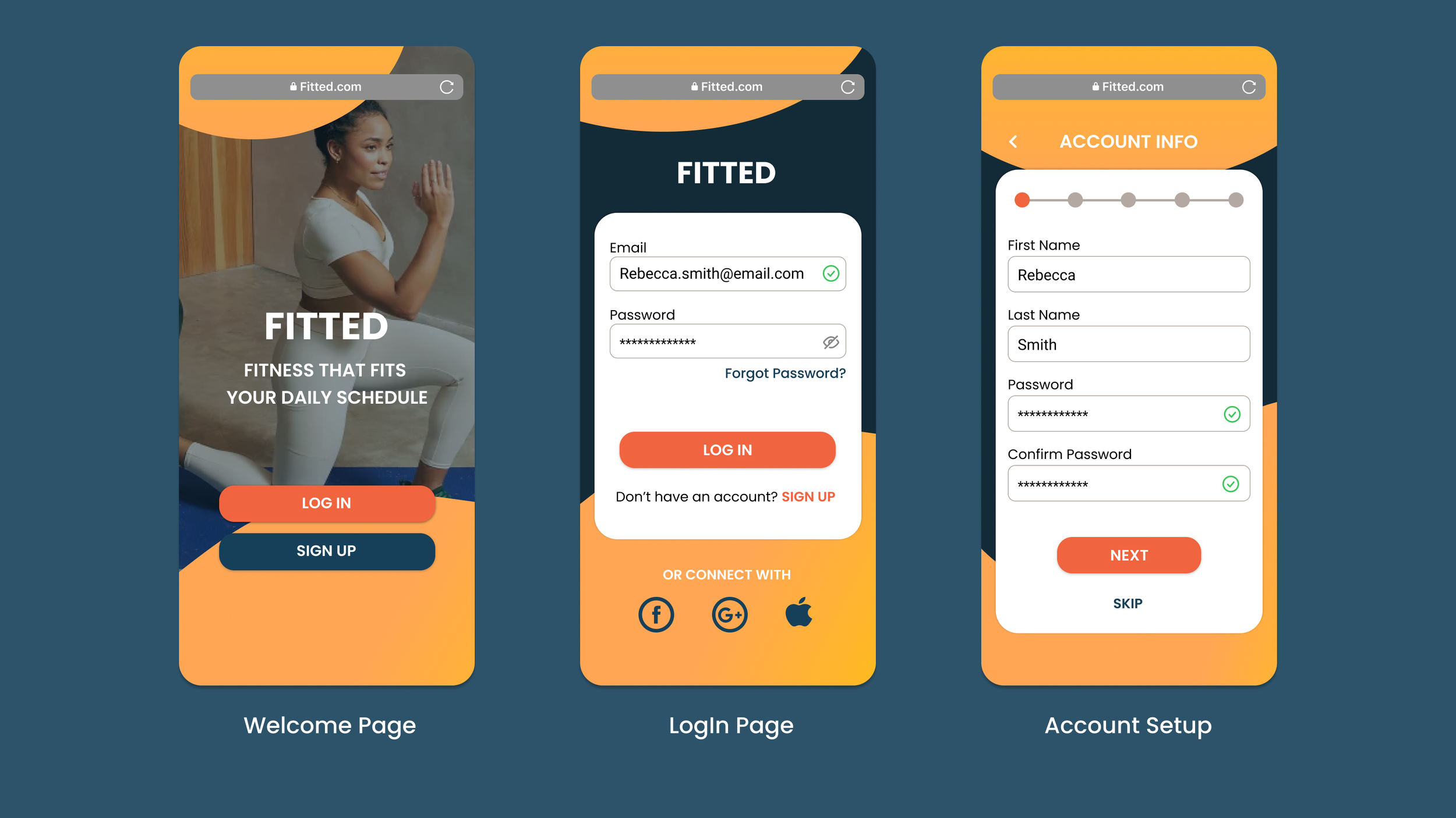
LOGIN / CREATE ACCOUNT
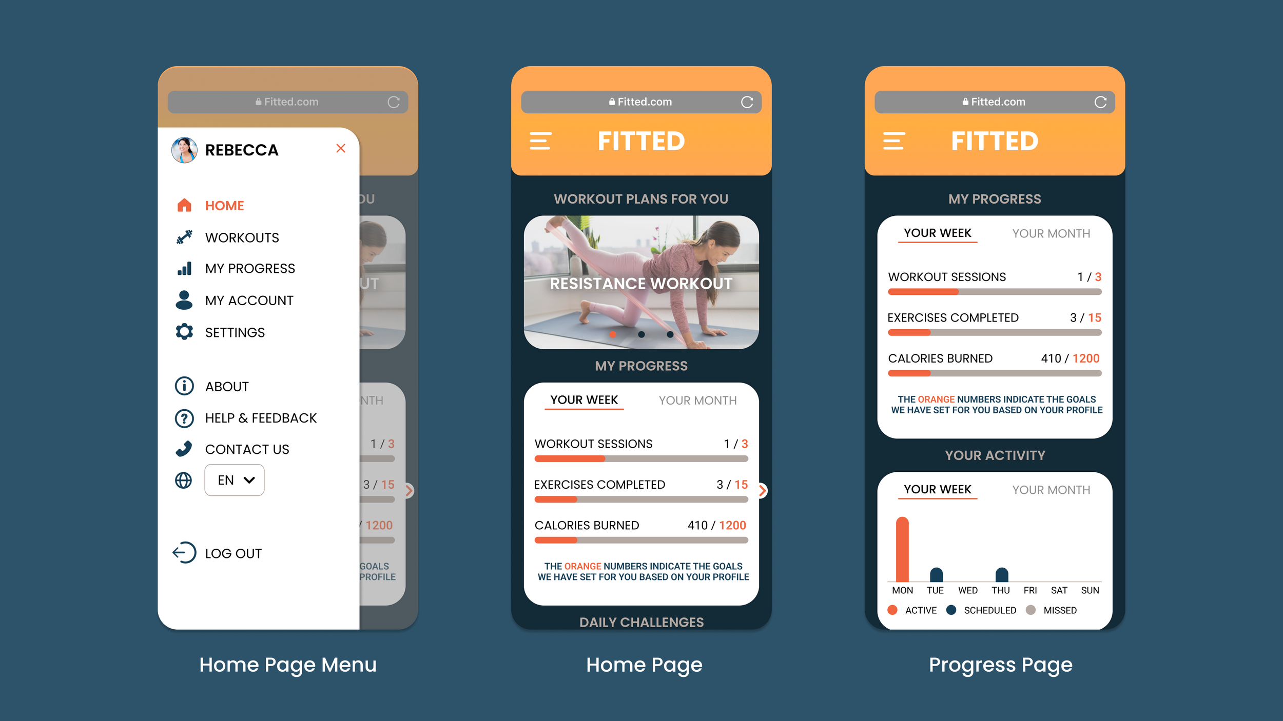
HOME / MY PROGRESS
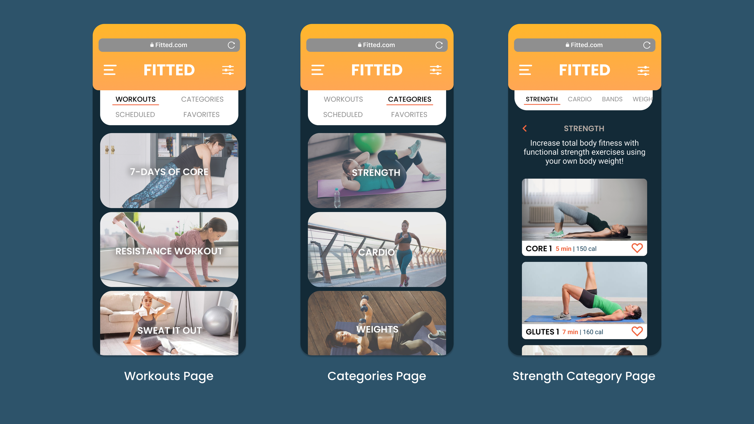
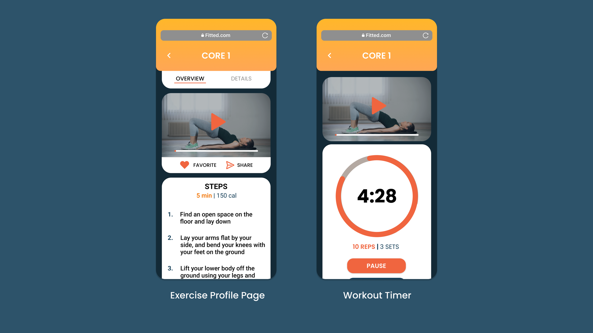
BROWSE & START WORKOUT
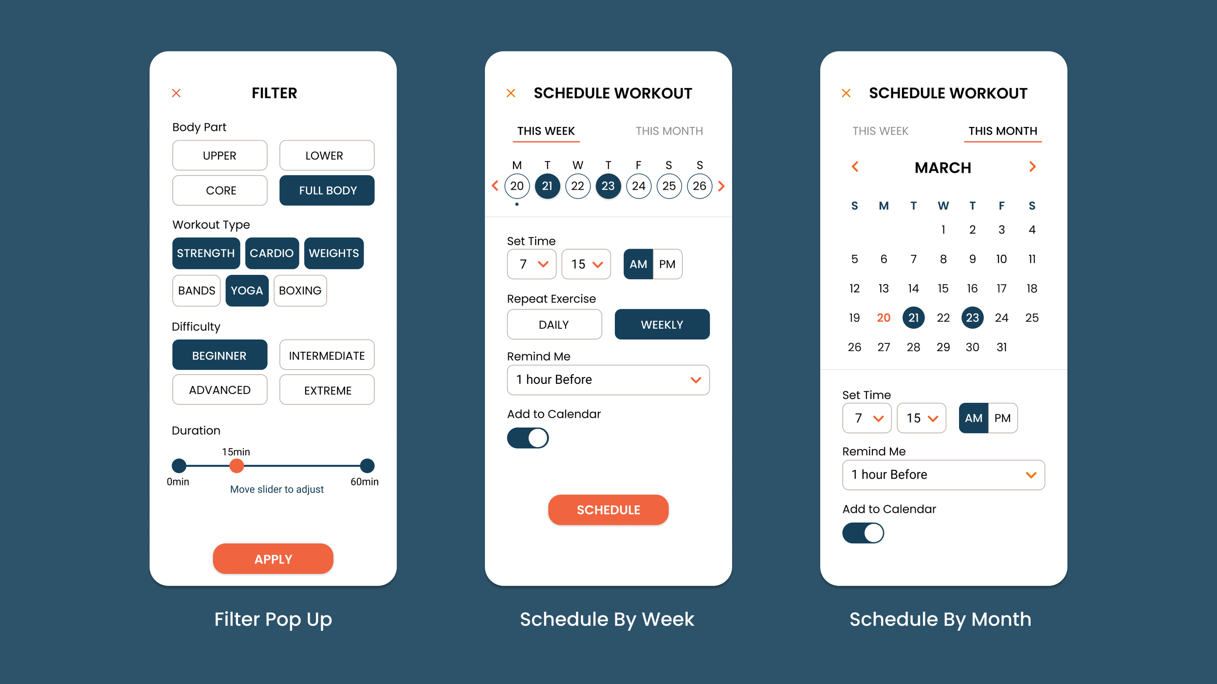
FILTER / SCHEDULE POPUPS
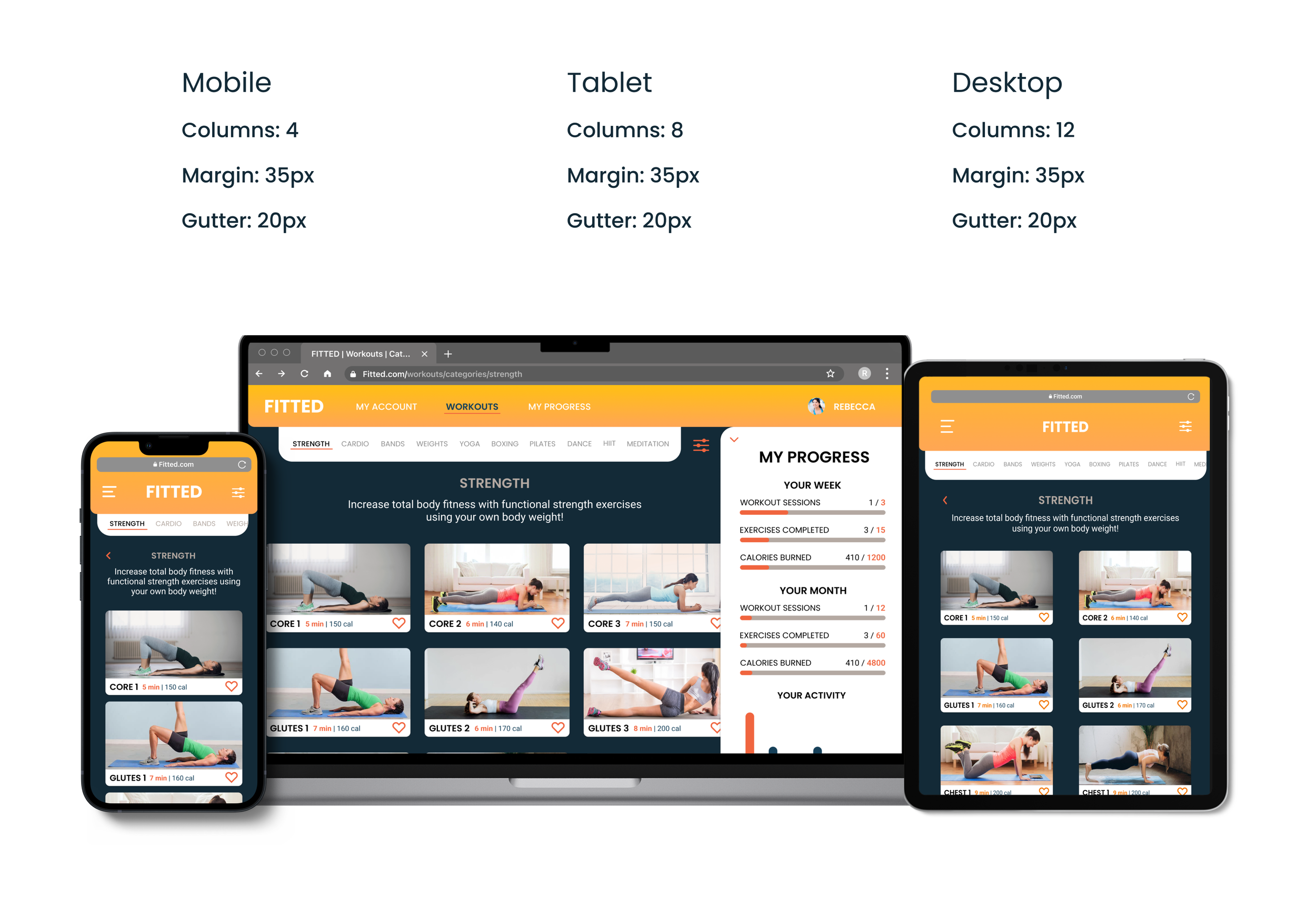
RESPONSIVE DESIGN
After designing with a mobile first approach and completing the prototype for the mobile screens, it was time to adapt the designs for larger breakpoints and flesh out the responsiveness of the product. This was done by using the grid tool and expanding it to fit each respective breakpoint.